A while back I ported ColorOS’s “spam blocking + caller ID tagging” system into my own LineageOS build: the tag database, pre-ring rejection, call log labeling—all working. But every time a call came in, what popped up was still the stock AOSP call screen—a drab gray slab with six buttons crammed at the bottom, looking like Android circa 2016.
All the features were there, but the face was still old. I put up with it for a while. I put up with it right up until last week when I added real-time captions to calls—at which point I couldn’t take it anymore: no matter how I placed the caption panel on that screen, it looked awkward. So I tore it down and redrew it from scratch, modeling it after the iPhone call screen.
One Screen Does One Thing
What’s good about the iPhone call screen? It does one thing per screen. The background is a blurred-out contact photo, the middle is the name and number, the bottom has six round buttons, and below that a big red hang-up button. No extra frames, no extra lines, no extra gray.
I restructured along this skeleton:
- Background: contact avatar scaled up 1.35 times to fill, with 48dp Gaussian blur layered on top; for numbers without an avatar, four color blobs are generated from the number’s hash as the base, with a vertical dark gradient pressed on top to ensure white text is always readable.
- Middle: real-time caption panel, one large frosted-glass block.
- Lower: 3×2 grid of six frosted-glass round buttons—mute, keypad, speaker, recording, captions, tag.
- Bottom: iOS-red (
#FF453A) hang-up button, 76dp, with a same-color soft glow ring.
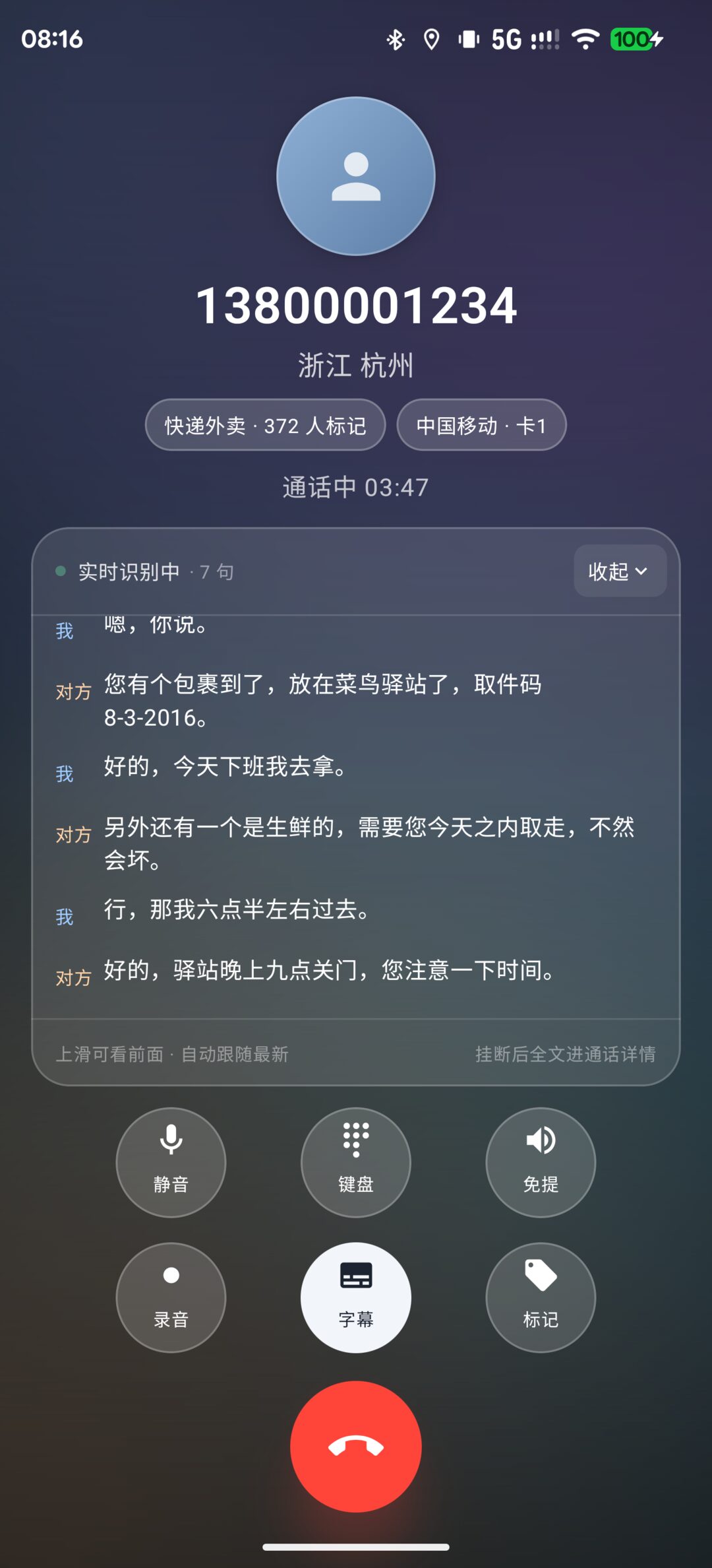
For the first version’s background, I took the lazy route and let the hue be completely random from the number hash. Looking at the screenshots: olive green, muddy yellow, liver purple—every screen a different complexion, like a knocked-over palette that was never stirred. Switching to four fixed base colors (blue 212°, purple 268°, cyan 188°, warm brown 24°), with the hash only allowed to jitter ±24° from the base, immediately normalized things. Random isn’t personality—it’s an accident.
The Black Square That Cost Me Two Hours
The frosted-glass button technique is straightforward: white 16% semi-transparent fill, plus a 1dp white 24% hairline stroke around the edge. On real hardware there’s no free lunch for backdrop blur—Modifier.blur() only blurs its own layer, not the content behind it—so the “glass feel” relies entirely on this semi-transparent white layer holding things up.
In the first version I casually added Modifier.shadow(6.dp) to each round button, thinking a bit of drop shadow would add depth. Looking at the screenshot, each of the six round buttons had a dark rounded square squatting inside it, like something dirty was pressed under the glass.
After digging around I understood: elevation shadows are drawn beneath the fill. The fill is 16% white, nearly transparent, so the shadow showed through from under the glass—a perfectly square black patch. On an opaque background, the shadow hides behind the surface where nobody sees it; on a semi-transparent surface, it becomes the star of the show.
Deleted the shadow, black squares gone. Never put elevation underneath a semi-transparent fill—this lesson cost me two hours and six wasted screenshots. Noting it here.
Three Caption States: Expanded, Collapsed, Hidden
Real-time captions are recognized segment by segment, scrolling up one sentence at a time. But the call screen isn’t a caption player—most people don’t want to stare at a screen full of text while on a call. So the caption button cycles through three states:
- Expanded: the full panel, swipe up to browse history, auto-follows the latest sentence;
- Collapsed: compressed to a single line, showing only the most recent sentence;
- Hidden: the panel disappears entirely, leaving only a small capsule in the top-right corner reading “Recognizing N sentences”—tap to return to expanded.
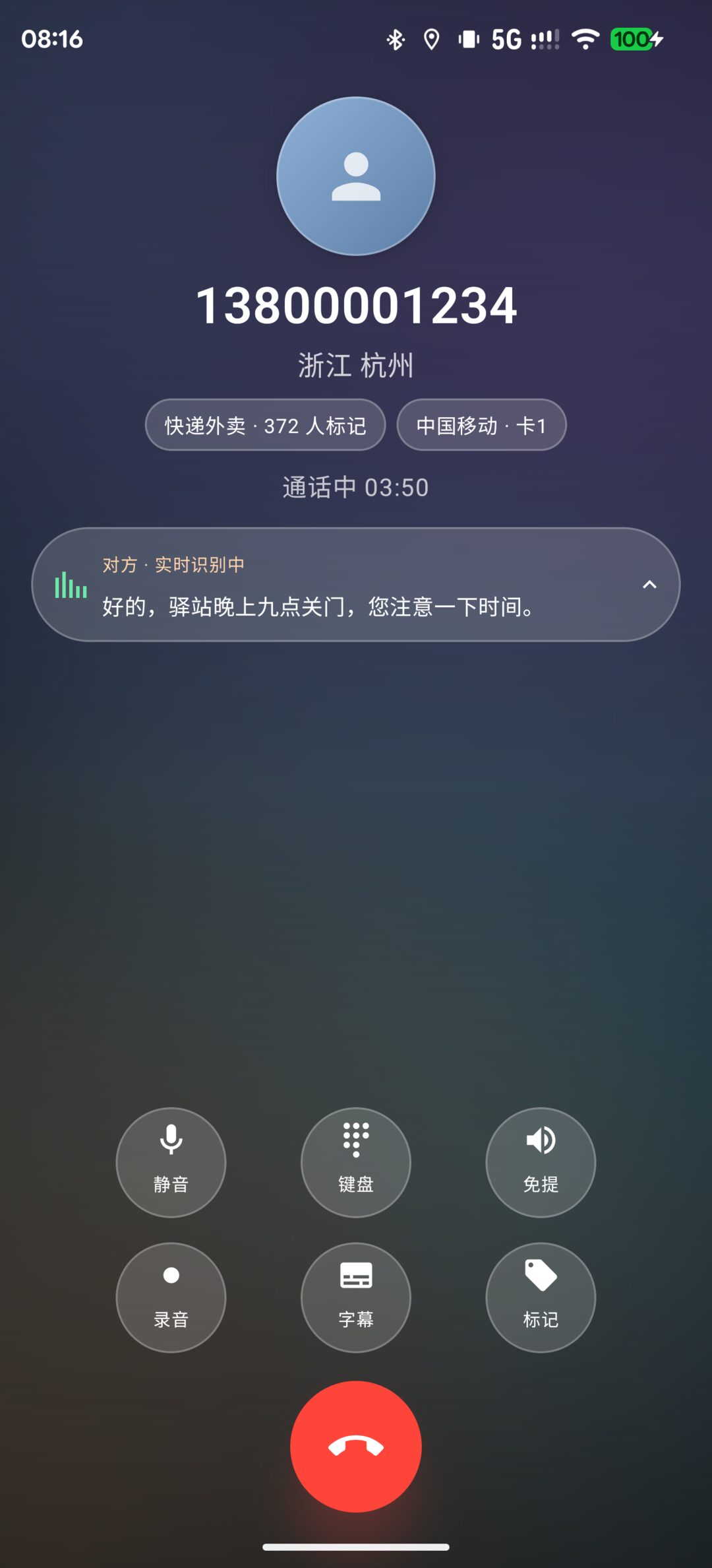
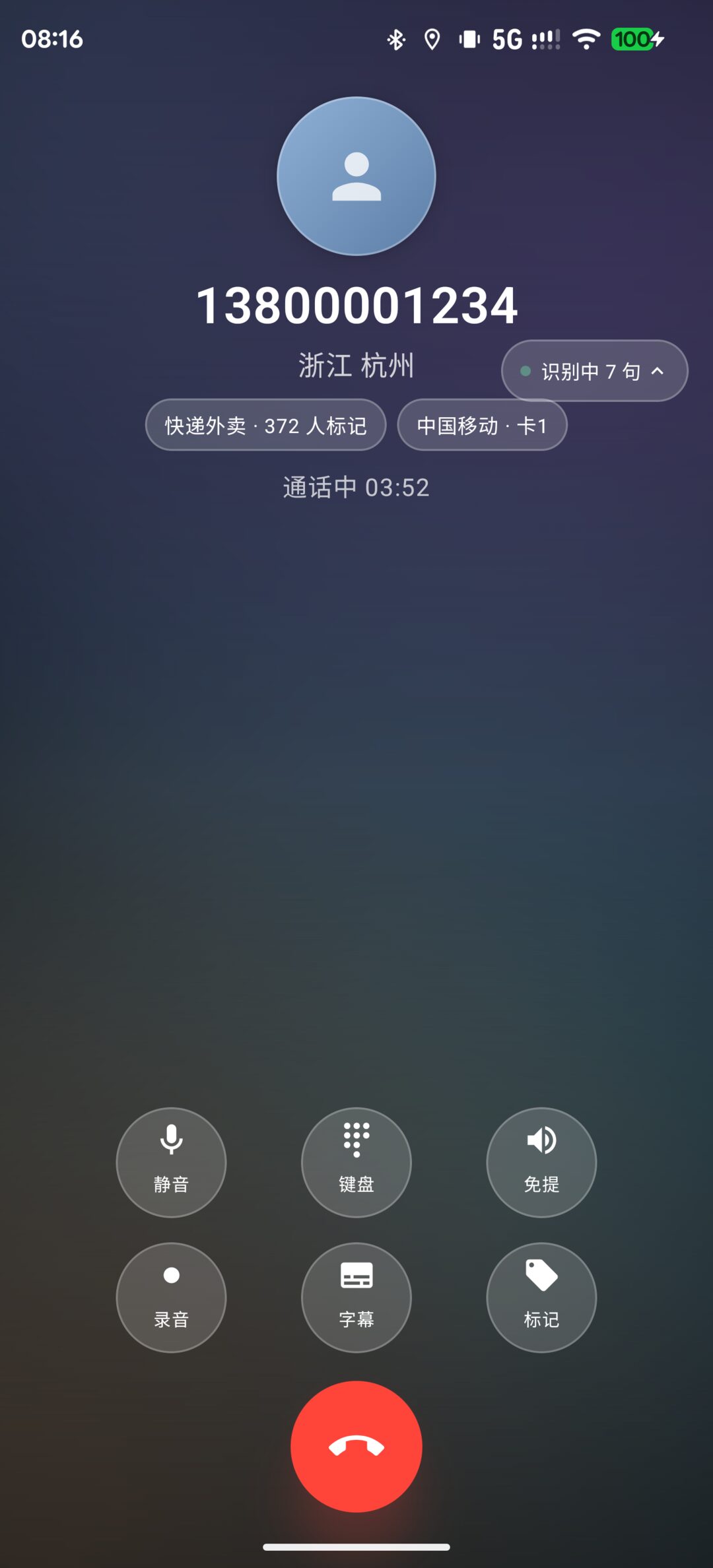
Each press of the caption button advances one step: expanded → collapsed → hidden → expanded. The state is written to SharedPreferences, so the next call picks up where the last one left off. The first version only had expanded and collapsed toggling back and forth—the hidden state was unreachable—because the button logic was written as a toggle instead of a cycle. This kind of bug won’t surface until you tap it ten times on real hardware.
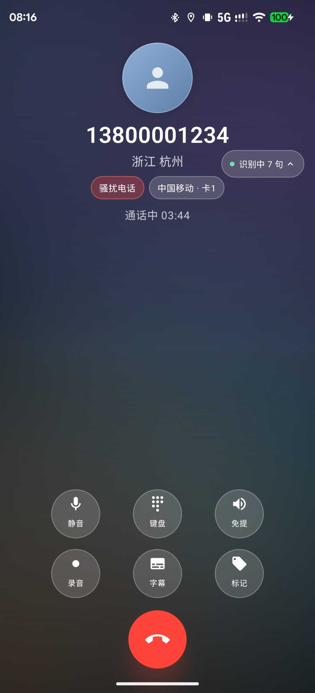
When a number is tagged as a spam category, the badge next to the caller location turns red, reminding you whether this call is worth answering:
Tagging During Calls: Horizontal Labels, Three Per Row
The tagging panel originally only appeared after hanging up. This time I brought it into active calls too—tap the “Tag” button and a sheet rises from the bottom, with labels arranged horizontally, three per row, multi-selectable:
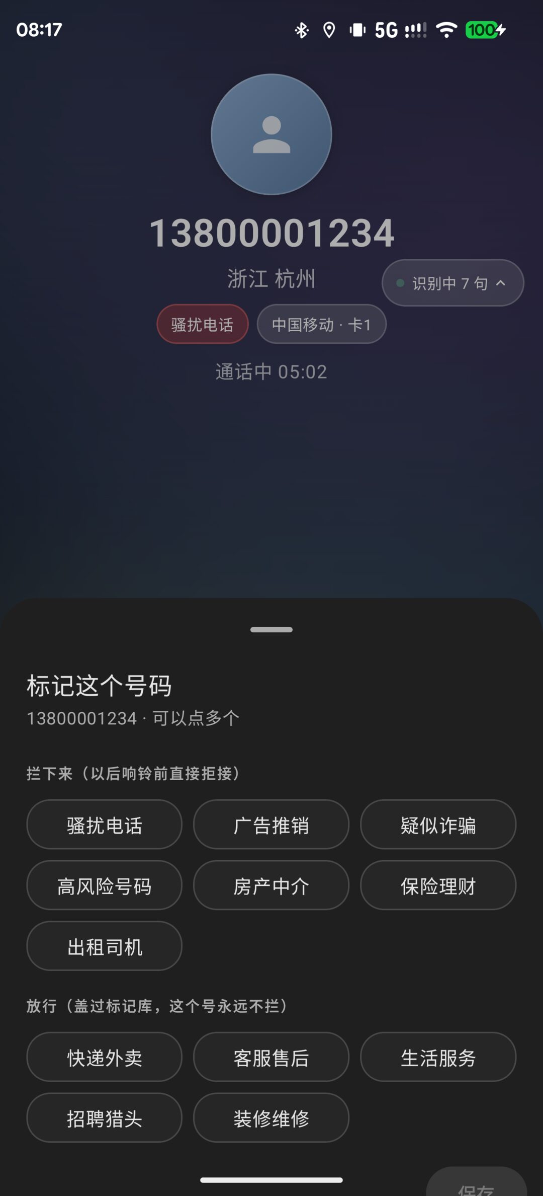
The top seven categories are “Block”: spam calls, telemarketing, suspected fraud, high-risk numbers, real estate agents, insurance/finance, taxi drivers—once tagged, if this number calls again, it gets rejected before the ring. The bottom five categories are “Allow”: delivery/takeout, customer service, life services, recruiting/headhunting, renovation/repair—these override the tag database; this number is never blocked.
There’s only one rule: as long as any “Block” category is applied, it blocks. Blocking is protection, allowing is an exception—exceptions cannot override protection. If a number is simultaneously “delivery/takeout” and “spam call,” it gets blocked.
No Real Calls—How to Verify the UI
This interface can’t be verified by making real calls—I don’t have a test number that calls in on schedule. The solution is a back door for myself: a debug broadcast TEST_INCALL_UI that injects a fake call into the UI bus (number, caller location, tags, call duration, seven lines of delivery conversation—all preset), then launches the call Activity and takes screenshots.
Along the way I hit a wall: startActivity inside the broadcast receiver was blocked by the system’s Background Activity Launch (BAL) restrictions, and the call Activity is exported=false, so shell identity couldn’t start it either. The workaround: on a userdebug ROM, adb root then am start, and immediately adb unroot after verification. The status bar times in those screenshots above—08:16, 08:17—were produced by clicking through five states one by one this way.
Usable Right Now, No Need to Wait for an Image
Someone might ask: after making these changes, do you have to recompile the ROM and flash it to use them?
No. The signed APK is installed directly to /data/app via adb install—what’s running on this device right now is the new interface; all five images above are real device screenshots. I also synchronously replaced the copy in the ROM source tree under vendor/, but that won’t enter /product/priv-app until the next full build—which only affects future flashing, device switching, or factory reset scenarios. For daily use, install it and that’s it.
With interfaces, having the functionality right is just passing—having the face right is what counts as finished. The previous version could block spam, could tag, could produce captions, but every time I answered a call and saw it, something inside me flinched. Now it doesn’t flinch anymore.
Worth it.
评论
0 条评论