As a programmer who loves running, I have always wanted to present my marathon experiences on the blog in a unique way. Ordinary text and static images can capture a moment, but they cannot recreate the inner journey of those 21.0975 kilometers.
So I decided to build a dynamic running-track visualization on the blog’s hero screen: using AMap as the canvas, drawing the GPX track in real time, and showing heart rate, pace, cadence and other professional running data alongside it.
This article breaks down the implementation of this feature in detail.
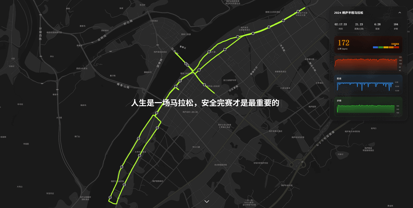
1. Preview
The finished effect contains these core elements:
- Full-screen immersive experience: the hero screen loads AMap in dark mode, paired with a typewriter-effect slogan.
- Dynamic track drawing: the route line extends across the map over time, like a game of Snake.
- Key milestones: automatically detects and labels key points such as 5km, 10km, half marathon and full marathon.
- Real-time data panel: a floating window in the top-right shows elapsed time, distance, current pace, live heart rate and cadence.
- Heart-rate trend chart: integrates Chart.js to draw the heart-rate curve dynamically.
2. Tech Stack and Preparation
- Map service: AMap JS API v2.0 (supports 3D views and custom styles).
- Data source:
.gpxfiles exported from sports watches (such as COROS, Garmin); I use COROS here. - Chart library: Chart.js (lightweight, well suited to simple trend charts).
- Framework: Hexo (EJS templating engine).
Applying for an AMap Key
First, register an account on the AMap Open Platform and create a Web (JS API) application to get a Key and a Security Code.
3. Core Implementation Steps
3.1 Page Layout
In layout.ejs, we need a full-screen container for the map and a data panel overlaid on top of it.
|
On the CSS side, the key is to set .hero-splash to fixed positioning with the highest z-index so it covers everything else.
3.2 Parsing GPX Data
GPX is essentially XML. We use the browser’s native DOMParser to parse it. Besides the basic latitude/longitude (lat, lon), we also need to extract heart rate and cadence from <extensions>.
|
3.3 Initializing AMap and Drawing the Track
When initializing the map, for visual effect we disable all interactions (drag, zoom) and use the dark theme.
|
The core idea for drawing the dynamic track is: create an empty Polyline, then keep pushing new points onto its path array inside a requestAnimationFrame loop.
|
3.4 Dynamic Heart-Rate Chart
Use Chart.js to create a line chart. For performance we do not render every point but downsample instead.
|
4. Pitfalls and Optimizations
- AMap Polyline color: the AMap API does not support CSS variables (like
var(--color)). The fix is to read the hex value of the CSS variable dynamically in JS withgetComputedStyle. - Cadence value off: the displayed cadence was only 80–90, far below the normal 170–180 for running. On investigation, the GPX records single-sided cadence (SPM); multiplying by 2 when displaying it fixes it.
- Slow CDN: Chart.js’s default CDN is slow to reach from within China; switching to
cdnjs.cloudflare.comnoticeably sped things up. - Stacking overlay: the map container had a high z-index, making the custom “scroll down” arrow invisible. Setting the arrow’s
z-index: 20and adding a text shadow fixed it.
5. Conclusion
Through this bit of tinkering, I not only made the blog homepage look “hardcore” and full of personal character, but also looked back on my own running journey through technology. Whenever I open the homepage and watch that winding track light up, watch the heart-rate curve rise and fall, it feels as if I am back on the course.
“Life is a marathon; finishing safely is what matters most.”
I hope this tutorial gives some inspiration to those of you who love sports and coding as much as I do.
评论
0 条评论